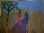
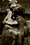
Elizabeth – Final Project
I figured I’d post my final project before the new year! Here are some pictures of the process and the final piece (instrument):

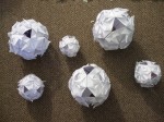
all the pieces


put together

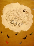
Mila _ Color and Light and Final
Sorry for the picture quality. My camera died so I had to photobooth it.
Ethan Zisson – Final Project/Color and Light Project


")
Araceli Mendez-Color & Light-Final Project
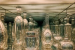
Xavi Sawada: Color & Light+Final Project-Underwater


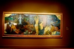
Emma Whitford Final Project — Painting
For my final project I chose to work with paint for the first time. It was quite the learning experience. Below is my finished product, the result of several failed attempts. I was intent on making my figures not just look like people (hard enough), but two specific people (good friends, a little stressful).
The little painting is one of my early exercises with color. I’ve been thinking a lot about what colors compliment each other. How can I make images jump off of a canvas?
")

Above: Michael and Lily
Below: Scale Shot: Annie (right)
Greg – Final Project


Greg – Color & Light

Rebecca – Final Project

Rebecca – Material Alchemy

Rebecca – Color and Light

robert mapplethorpe
Pleasure in Looking (eve)


“I’ve gone from saint to whore and back to saint again, all in one lifetime.”– Ingrid Bergman
“I don’t want to dress up a picture with just my face” –Grace Kelly
“I think the quality of sexiness comes from within. It is something that is in you or it isn’t and it really doesn’t have much to do with breasts or thighs or the pout of your lips…You have to be born a sex symbol. You don’t become one. If you’re born with it, you’ll have it even when you’re 100 years old.” –Sophia Loren
“In a world ordered by sexual imbalance, pleasure in looking has been split between active/male and passive/female. The determining male gaze projects its phantasy on to the female form which is styled accordingly. In their traditional exhibitionist role women are simultaneously looked at and displayed, with their appearance coded for strong visual and erotic impact so that they can be said to connote to-be-looked-at-ness. Woman displayed as sexual object is the leit-motif of erotic spectacle: from pin-ups to striptease, from Ziegfeld to Busby Berkeley, she holds the look, plays to and signifies male desire. Mainstream film neatly combined spectacle and narrative…The presence of woman is an indispensable element of spectacle in normal narrative film, yet her visual presence tends to work against the development of a story line, to freeze the flow of action in moments of erotic contemplation. This alien presence then has to be integrated into cohesion with the narrative…A male movie star’s glamorous characteristics are thus not those of the erotic object of the gaze, but those of the more perfect, more complete, more powerful ideal ego conceived in the original moment of recognition in front of the mirror. The character in the story can make things happen and control events better than the subject/spectator, just as the image in the mirror was more in control of motor coordination. In contrast to woman as icon, the active male figure (the ego ideal of the identification process) demands a three-dimensional space corresponding to that of the mirror-recognition in which the alienated subject internalised his own representation of this imaginary existence. He is a figure in a landscape…Women, whose image has continually been stolen and used for this end, cannot view the decline of the traditional film form with anything much more than sentimental regret.” –Laura Mulvey
“‘But I never looked like that!’ – How do you know? What is the ‘you’ you might or might not look like? Where do you find it – by which morphological or expressive calibration? Where is your authentic body? You are the only one who can never see yourself except as an image; you never see your eyes unless they are dulled by the gaze they rest upon the mirror or the lens (I am interested in seeing my eyes only when they look at you): even and especially for your own body, you are condemned to the repertoire of its images.” –Roland Barthes
Charis Loke – John Howe: A Few Lines on Making Lines
John Howe is one of my favourite artists – most well known for his illustration work, an example of which would be the famous Gandalf painting – and he writes beautiful blog posts. His most recent one concerns the etymology and history of that most ubiquitous of art tools, the pencil.
Araceli Mendez- In Bb
I dare you to play them all.
Araceli Mendez– Canstruction! Wacka! Wacka! Wacka!


katie glerum: material alchemy
I immediately thought of these dresses when we started talking about material alchemy. They are made out of condoms and were made to promote the use of condoms in the fight against HIV/AIDS
website with more pictures: http://ahboon.net/2007/07/19/condom-fashion-show-in-china/


eve-dresses made from phonebooks


Elizabeth – Found Art


“Cookware cityscape”…
Then there’s this women who I met at a a crafts fair in Israel, twice actually, who makes things from plastic bags. It seems like pretty standard recycling, but she puts together bags with all different themes and jokes…

Tim – Arman
Here are some works by the artist Arman. I’m not sure how well his art fits the description of using things of minimal value, since cars really aren’t that cheap. But I think he puts an interesting spin on material alchemy because he doesn’t make something new and beautiful by changing the objects themselves in any way, but by simply putting them together, using them as another might use paint. 


Greg – things of minimal value transformed

I don’t remember what this piece was called, but it was on display at the Hirshhorn Museum in Washington, DC a couple of years ago. As you can see, it uses many items most people would consider junk and transforms them into something much more interesting and magnificent.
Mila

Found Art – Eva Hesse –Emma

No title, 1968: glass and metal case containing six objects
Top: A: latex, metal-screen, pins B: latex, cloth-tape.
Middle: C: latex, mesh, rubber, D: latex, cotton, rubber
Bottom: E: latex F: latex, plaster
Eva Hesse (1936-1970) was a German-born American sculptor, a pioneer in fiberglass, latex and plastics. She was also a leader of the minimalist and post-minimalist movements. Aside from fiberglass, most of Hesse’s materials do not typically age well. This has driven conservators crazy over the years, but many fans of her work believe that gradual alteration has given her pieces more value.
Michael Norris – two recycled products
The butterflies create art in the afterlife in this kind of creepy butterfly graveyard.

here is something else made from old vinyl records, but this is designed for practical uses. i think i want one

Aleph Assignment + Piece of Paper — Emma
Below are two approaches to the Aleph assignment.
The first one is more literal: I’d like to look at the back of my head straight on (not through two mirrors at an angle).
The second is about color saturation, which I find to be beautiful. I also like the idea of holding a beautiful image in my hands.


In the final image, I was messing around with the idea of making the two-dimensional look three-dimensional. Not sure how successful it is, but it stretches the idea of morphing a single pieces of paper into something different. I think the palm wrinkles especially jump out.

Rebecca – Recycled Art
This is a wave made from vinyl records. The piece behind is a cluster of tin cans, and I’m not sure what the bird-like piece is made of. 
Cartoon–Emma
Couldn’t get this up last week due to scanner failure. I’ve been reading Moby Dick for my American Renaissance Lit. class, and wanted to try to convey a really wacky scene from the novel in cartoon form.
Basically, a sailor falls into a hollowed-out whale head secured to the side of the ship. His weight causes the head to fall into the ocean. Queequeg, another sailor, saves the day.
I’m putting up both, because my first scan was unintentionally black and white, and I think I like it better.


Newspaper Objects-Xavi
Here are some cool pieces made almost completely out of newspaper I found on recyclart.org, a website aimed at exposing good products made out of re-used materials. Check it out!
Newspaper baskets:
Newspaper extendable bench:


Araceli Mendez– Bilt Furniture
BILT is a design collaborative founded by four recent graduates of Brown University. They have currently been working on pieces made of reclaimed construction lumber dating from around 1870 that were removed from Rhode Island Hall. 

More pictures of their work can be found at: http://biltfurniture.com/
LAURA LAINE:FASHION ILLUSTRATION


the concept of clothing has to come fromsomewhere.
follow the bread-crumb path backwards: start on the seams of a shirt and trace it back to it’s original idea.
MAYBE THIS IS WHAT YOU WILL SEE in the space between begining and end

Leigh Ofer: One man’s trash is another man’s treasure
 HA Schult’s “trash people” project took him 6 months and 30 assistants to create this wonderful work of art composed of random crushed cans, disassembled computer parts, etc. The reflections on the wall are haunting and immediately drew me with their stark despair and hopelessness. Using the combination of light and dark to create the reflections on the wall, I believe Schult recreates in the viewer’s mind the feelings of despair that drives a person to the street. Living on the streets represents the lowest rung on society’s ladder, and by looking at Schult’s project, forces one to think of hypothetical situations that causes someone to resort to such a state.
lauren armstrong – material alchemy
The first artist I thought of when we started talking about material alchemy is Scott Fife. I saw a show of his in Seattle of these amazing heads made out of archival cardboard. This particular show was called “The Idaho Project.” Each sculpture was a Roman bust-style portrait. You can’t tell what the material the artist used until you take time to look really closely at the subject. I think it is amazing what he can achieve with a material as simple as card board!


rocio- material alchemy
IBM engineers have invented a unique, eco-friendly way to recycle scrap silicon “wafers” -the base material used for chips in everything from computers to consumer electronics – and is making it available to the solar energy industry to produce solar panels. The new process has dual advantages for the environment, as it will help reduce the estimated 3 million silicon wafers discarded each year across the computer industry, while also providing new supplies of raw materials to the supply-constrained solar energy industry.
Araceli Mendez- Not Exactly Stop Motion Animation
Although its not stop motion animation, I found it fascinating that this 28 minute film is composed of pictures and one 2 second video.
Here is the first part of the film
Araceli Mendez-Comic Strip

Xavi-Comic Strip

Charis – Pull-tab Handbags

Taken from http://www.treehugger.com/design_architecture/?dtc=th_nav_design, at which there are other great ideas on reusing items.
cool stop motion animation
thought this was sweet so id post it for everyone
🙂
katie glerum
super sweet paper animation
This is by an artist Jen Stark who uses construction paper as a medium for drawing, sculpture and animation. A true alchemist.
Mila – Comic Strip

Rebecca-Comic strip
a sketch for an idea
Leigh Ofer – comic strip

Lauren Armstrong- three cell comic strip
I spent a lot of time trying to think of something funny, but I couldn’t bring myself to ever actually create any of my “funny” ideas. I decided to think of the assignment more as an informal, design-based triptych. I decided to use the symbol of a chameleon as someone who tries to impersonate famous art. The chameleon in these images unsuccessfully tries to emulate these art works. This chameleon is a persona non grata…a chameleona non grata…

Elizabeth – Comic Strip

age is just a number
I was surprised by how much the numbers could say. I liked working with simple figures and ideas to make a point.
Charis – Cut-Out Comic
I wanted to create something that people could take away physicallyfrom the newspaper they read daily (and chuck away 10 minutes later) but not actually use. Each cut-out comic features things that are ostensibly used in real life and would also be made out of paper in reality, like stamps and coupons and guides, but with content that is too fantastical to be of any use.
Among the ones not uploaded are a Guide to Fantastical Critters (in case you cross paths with a Squg on the way to the VDub) and instruction manuals for operating Buttons of Doom, as well as antique-style advertisements.

This one features stamps that one could tear out and use, assuming one still keeps the antediluvian art of mailing letters alive, and refuses to have the Post Office stick their newfangled barcode stickers on one’s envelope. Since some stamps are illustrated using the engraving technique, and because a lot of comics appear to be done in a rushed, hurried way, I decided to use an illustrative style which closely mimics that which one might get from an engraving (e.g. constant width lines, swelling strokes, creating shade through thickness of line). The actual drawing is much finer than what’s on screen, though. Everything besides the illustrations was purposely kept simple and careless to further emphasize their detail – something which would also presumably contrast with other comics on the same sheet.
Comic-ethan
I wish I was funny.

Katie Glerum: A Tomato’s Bad Trip

eve

Amanda- comic strip

Greg – comic strip

Tim – Janus Comic

My aim here was to draw a comic that could be read either direction, starting from any panel. Unfortunately, due to time constraints, I’ve only been able to work out a rough sketch of what I would like to do. Ideally the images would go better with the text and would be more polished (we didn’t do weeks of drawing for nothing!), and the dialogue would also be improved. It would be great if each ring didn’t stand alone, but the different pie slices of the whole circle could be read together as well. Consider this a continuing project!
rocio- comic strip


::MFA::


“Down with Life”
Animation– Lauren, Leigh, Leila and Rebecca
Animation: subliminal waldo
by araceli, charis, elizabeth, julie, and greg
Animation
Here is “Yesterday” by Ethan, Amanda, Tim, Emma, and Sophia!
Rebecca – Travel Photography
http://www.tomrobinsonphotography.com/centralamerica.html
The link above is to a travel photographer whose site I stumbled upon. I think these pictures genuinely capture the essence of these locations, at least that’s what I thought of the central america album. You should all check them out. They’re beautiful.
Leigh Ofer – stop motion animation
Stop motion animation – Elizabeth Karin
Blast from the past — Emma Whitford
This is an excerpt from Frog and Toad–claymation made in the mid-80s and adapted from a classic children’s book. I distinctly remember this scaring me as a kid, especially when Frog starts to shrink in his seat.
cool animation – ethan
HANS HANS Bellmer bellmer bellmer
{[(so i know at least one of you knows who this.0]}
however i thought it would be sweet to spread the word on [hans bellmer].
his sketches also have a nice bit of volume to them

he is one of my favorites and a nice big book on his work from the RISD library is staring me in the face.
Julieta CARDENAS: film
okay, so this is how it goes:
the top two videos were made by my friend micah t. who is also a freshman here at brown. I really like the way he incorporates music into his animations.
the third video is a music video that is not stop-motion but may inspire some new thought.
the last video is some experimental film by one of my biggest influences Stan Brakhage. This piece mothlight, was created by pasting the wings of moths directly on film and then painting over them. Frame, by frame. His videos have really influenced the way I think about the potential of film. I actually love working with video and creating video installations and am really excited for this project.
CHEERS !
Greg Young – stop motion animation
In honor of the Andrew Bird concert at Lupo’s last night, I thought I’d post a link to one of his music videos that uses stop-motion animation:
animations- rocio
Here are the clips of two animations I really enjoyed watching:
Hope you like them.
Lauren Armstrong–stop animation
Here is an example of a pretty simple technique using clay. Despite how simple it is, I still really like the end result because it really brings this blob to life and gives it a personality.
Araceli Mendez- Stop Motion and Music Videos
Here are two great examples that I found of stop motion in music videos.
Stop motion (Amanda)
ANIMATION (eve)
GRAFFITI ANIMATION!
CLAYMATION! (“My Baby Just Cares for Me,” Nina Simone)
Leigh Ofer – replica
 This is a replica of Picasso’s Le Miroir. First I drew the painting in my sketchbook, scanned it, and edited in Photoshop. I first played with the levels, contrast, and curves of the picture to get the right sharpness and color. Then I added layers of color and played around with the layer styles. Lastly I added various brushes to give it a sort of “grungey” feel, which is what I believe gives it a more personal touch.
Leigh Ofer – self portrait

Self Portrait – Ethan

I went to town in the MML with the wacom tablet. I traced in Illustrator, then brought the image into photoshop to give it some color. Half of my face is filled with white space because I don’t believe I know enough about myself to accurate portray my own character. (Also when I drew all of those lines, it got to be a little crowded.) The squigglies on the side are meant to look like a heart monitor, going in one ear and out the other.

This was the original photo I worked off of. Leigh was kind enough to take it for me.
I hope it’s okay I submitted this assignment in the form of blog post, I figured it would be better than making a crappy print out from my printer. I would like to figure out how to print off of the MML’s nice photo printers on good paper at some point.
Dali Animation
A friend showed me this the other day. I thought it had some relevance because we are about to venture into the world of animation, and this is a really good one. – ethan
Walter Benjamin
“Even the most perfect reproduction of a work of art is lacking in one element: its presence in time and space, its unique existence at the place where it happens to be.”
Benjamin states that when unauthentic art is appreciated, that is when art becomes based not on art, but on politics. When I read this text, the first artist that came to my mind was Andy Warhol. The mechanical reproduction of his works is ongoing, the majority of his sales are not original pieces, yet the public still respond well to his work. The popularity of his pieces indicates that to a certain degree the ‘aura’ of his artwork still remains, as the public still has some connection with his art. Or perhaps the public are not connecting with the art, but in fact are connecting with the idea of art.
Perhaps the definition of art itself is changing rather than the acceptability of mechanical reproduction. Is the marketability of mechanical reproduction in this instance so successful because the meaning of art and its value has changed? Is mechanical reproduction of Warhol’s work so widely accepted because the public does not understand the essence of his artwork? Or is it accepted because art today has become politically and commercially driven?
I wonder if people enjoy his artwork for the accuracy of the mechanical reproductions, or in spite of mechanical reproduction. If mechanical reproduction adds another level of artistic value to the piece, does that mean that mechanical reproduction itself should not be criticized for taking away the ‘aura’ or ‘presence in time and space’ of the piece, but rather because it is does not fit the general critically acceptable view of art as ‘unique’?
It is interesting to analyze Andy Warhol’s view on mechanical reproduction and the commercialization of art. Here are two of his quotes:
“Making money is art and working is art and good business is the best art.”
“I’ve decided something: Commercial things really do stink. As soon as it becomes commercial for a mass market it really stinks.”
Both statements seem to contradict each other; it is as if Andy Warhol himself could not pinpoint if (and why/why not) mechanical reproduction is acceptable, for the public and for the artist.
Walter Benjamin Essay Response – Ethan Z.

This is one of Ellsworth Kelly’s numerous pieces. He is a renowned modern artist and people pay hundreds of thousands of dollars to own his artwork. Obviously, it is extremely reproducible, even without modern technology. Yet, people still buy the real thing. His work is on display in museums across the world. Obviously, Kelly is not a renowned artist for his technical prowess, but his creative integrity. Sure, we all could make great imitations of Kelly pieces. However, none of us thought to produce them on our own in the first place. None of us had that creative thought. Kelly’s art can never honestly be reproduced, because the the reproduction would lose the original’s only real value – its originality.
Eve and Benjamin
Benjamin’s concept of aura as shattered by mechanical reproduction is antithetical to all contemporary cultural creations, given the conditions of mass public consumption and commodification. One could even say his conception is contrary to any artistic production in the past, present , and future because an art work is never totally original–it’s inevitably influenced by its social environment and artistic canon. Pop artists, specifically, make an excellent commentary on this dilemma of originality by appropriating works of past artists, newspaper articles, celebrity images, and known cultural iconography, in often mocking, satirical fashions, and sometimes even in homage.
Yasumasa Morimura is a contemporary Japanese photographer who plays with this idea through his manipulation of Manet’s Olympia–substituting his own face for the three characters in the image. He undermines the seemingly factual nature of photographs, by making his work highly fictional and staged. He pays homage to past art forms–prior the the age of mechanical reproduction–by conflating his photography with the aura-filled art of painting. Moreover, his identity as a Japanese man contemplating a once very controversial European painting is at once challenging for the viewer and surprisingly appropriate.

Mila – reaction to Benjamin’s Essay
I liked this essay. It made me think about art and beauty, which I like to do. I read it early in the morning while slightly ill and I think this was an appropriate and philosophically receptive frame of mind. These are the things I latched on to, dramatically formatted below:
The idea of artistic function – that art can be reduced to the societal and political environment of its production time and comes about as a direct result of these and therein lies its significance. It is a showcase of an environment rather than the expression of an individual. (right-brained people tend not to like this idea I think.)
Feeding into that is the fallacy of imagination – that true creativity does not exist, our experience is a set of chemical reactions and art arises from a particular set of neural activity. I love this idea of the intersection of art and science, or really, the dominance of science over everything and the transformation of a mundane and predictable series of reactions into a transcendentally beautiful (sublime) experience.
Who is in control, then of art? Has the rise of modern art has put the power in the hands of the audience (absorbing rather than being absorbed) or taken it away (‘I can no longer think what I want to think. My thoughts have been replaced by moving images’). If we accept the idea of art as a function of environment, no-one has control. If we accept the idea of god, then god has control. And if we are Facists, we use the desire for control over aesthetic self-expression to achieve control over rights generally perceived as more fundamental.
Rarity; widely valued but also widely regarded as a desire that is not entirely wholesome and one that arises from greed and love of power (rare things have a certain power, because only a small percentage of the population can possess them). Does rarity occlude the true aesthetic experience of art and is this point the purpose of, for example: the Dadaist’s use of elements of little value in their work?
The seemingly primal and usually controlled urge for the destruction of beauty, which is part of the reaction to beauty. War is an example of a loss of this control. It is not a natural state, yet all humans understand the desire for violence and destruction. If we respond to and seek to bring about cyclical change, is destruction simply part of the aesthetic experience?
Response to Walter Benjamin’s “The Work of Art in the Age of Mechanical Reproduction” – Elizabeth Karinn
Early in this week I walked into a conversation in my building where people questioned the value of a piece of artwork if it can be hanging as a poster in college dorms around the world. It was rather fortuitous that we were asked to read this essay since I had already been thinking about the question of reproduction. I believe that art should be accessible. That can mean that a college student without the funds to own impressive originals is still able to cover his or her walls with posters that show famous artwork from Monet or Picasso. Though there is obviously an entirely different experience that goes along with viewing an original piece of artwork, reproductions break down the exclusivity that seems inherent in deeming originals the only acceptable works of art. Accessibility, in my mind, also relates to what Charis said about formal art classes. It may be partially due to my own bias, having very little experience with art classes before this one, but when art becomes overly academic and overly formal it becomes less enjoyable. I think that art is often produced so that it can be seen and interpreted by as many people as possible, so placing too much value on the originality of a piece works against that intention.
lauren armstrong — Walter Benjamin Response
I really enjoyed reading this excerpt from Walter Benjamin’s The Work of Art in the Age of Mechanical Reproduction. This is the first time I’ve ever read anything about the idea of the unique existence of art or the effects of reproduced art. I had never before considered the implications of a piece of art work’s “fitness for exhibitions.” It seems to that as art became more easily reproducible or transportable, its value shifted to become based solely upon whether or not masses of people could view the piece. This brings to me the question: “Who decides what value to give a piece of art?” I know that we have discussed the question of “what” art is, but I now wonder who decides the value of an art piece. I think that the value of a piece of art can only be decided by the person viewing the piece. However, and I find this unfortunate, our society is able to place a value on certain pieces or types of art through pop culture or attaching a numerical value. These ideas almost make me sad. I like to think of art as a personal form of expression and creativity; however, once an artist puts their work out there for the world to see, they have very little control over how everyone else will judge it or place value on it. I guess that is just the nature of sharing your work with the public.
“Art in the Age of Mechanical Reproduction” Response –Emma Whitford
This week in my Modern European Intellectual History Class we watched “Triumph of the Will,” directed by the famous fascist-intellectual filmmaker Leni Riefenstahl. The film details the 1934 Nazi Party Congress in Nuremberg, and is recognized both as Nazi propaganda and as a beautiful example of cinematography. The film is a perfect example of “the total function of art..reversed.” Benjamin states, “Instead of being based on ritual, it [art] begins to be based on another practice–politics.” Film can be easily reproduced and distributed to the masses , so its creation no longer carries the weight of ritual. Therefore, Benjamin suggests, the purpose of producing film is to take advantage of its reproduction capabilities. Even the most convincing propaganda film cannot serve its purpose unless it is reproduced and viewed by mass audiences.
In his epilogue, Benjamin suggests, “The logical result of Fascism is the introduction of aesthetics into political life.” In the 1930s the Nazi party found that one effective way to unite Germany behind its cause was to present an idealized image of the German volk in film. “Triumph of the Will” bombards the viewer with images of millions of gleeful Germans, waving flags and hailing Hitler. Interspersed throughout are sweeping arial shots of the majestic towers of Nuremberg, and angelic children laughing and clapping for the Nazi parade. It is through the reproduction of such a film that art serves its new purpose–to unite the masses behind a dominant political ideology.
Tim – Benjamin Response

Walker Evans – Hale County, Alabama – 1936

Sherrie Levine – After Walker Evans – 1981
I think Sherrie Levine makes one of the most interesting commentaries on the questions of reproduction and originality that Benjamin raises in his essay. She took pictures of Walter Evans photographs in an exhibition catalog then displayed them as her own. For me, this act raises a series of questions I prefer to leave open: If these two pictures look essentially the same, do they have different artistic value? Each obviously sends a different message, so how does context influcence art? Is one of them better, more interesting? If I rephotographed Levine’s rephotographs would that have the same force as her originals? To put each of those pictures online, someone already had to take pictures of them. Is something lost in this process, as Benjamin suggests, or is something gained, as Levine demonstrates?
Rebecca McGoldrick – Response to Benjamin
My first thought, even from section I, was Warhol. I cannot ignore what Benjamin is saying, but I do think that replicated works can have a different, and sometimes stronger message than there originals. “One might generalize by saying: the technique of reproduction detaches the reproduced object from the domain of tradition. By making many reproductions it substitutes a plurality of copies for a unique existence. And in permitting the reproduction to meet the beholder or listener in his own particular situation, it rectivates the object reproduced.” I think this exerp sums up how I feel about reproduced art in three sentences. Warhol lends new purpose to mudane objects like a soup can. But when the soup can is mass produced, it makes a new statement of mass consumerism and familiarized objects. Marilyn Monroe was (and still is) a world sex icon, and by placing a bunch of replicas of a print of her on a single canvas, it shows that she is just a face to many, a mere subject of the eye. I think replicas are highly important to the survival of art, and should be valued in a different light than there originals, but maintain an importance of their own.
Greg Young – Response to Benjamin
“To an even greater degree the work of art reproduced becomes the work of art designed for reproducibility.”
This line was what struck me most about the Benjamin essay. Though Benjamin discusses film and photography in relation to painting, I found it quite odd that another important medium of art was conspicuously absent: music. All of the reproducible qualities of film and photography that set them apart from painting are even more inherent to music, especially in today’s industry. Pieces of music are now composed primarily for mass consumption in the form of compact discs or even digital media, so every song we hear is a copy of the original. But what is intriguing about the application of Benjamin’s theory to the realm of music is the confusion as to what the original actually is. In film, the artist records and edits video to make a product that is then reproduced. Most music, however, is rehearsed multiple times and then recorded in the studio. But what is the original work of art in this case? Is it the written song? Is it its first performance? Or is it the first recording of it that is made? Even live performances of a song can be considered reproductions. On the other hand, no two live renditions of a piece of music can be exactly the same, so is each successive performance an original work of art? It seems that music is even further detached from the concept of originality because the original no longer matters, the reproduction is the only form with importance.
Benjamin also mentions that “painting is in no position to present an object for simultaneous collective experience” and goes on to explain that this collective experience is indeed a property of modern film, as films are initially viewed in the group settings of theaters. Despite the fact that music was initially only live performances to a mass audience, in today’s world it is primarily consumed alone. Similar to the way a painting invites a spectator to contemplate in solitude, music invites a listener to deeply focus on what he or she is hearing in a private setting. So even though music is more about its reproducibility than film, it echoes the qualities of a painting in that it lacks a collective experience, demonstrating the complications of Benjamin’s theory on the reproduction of art in the modern world.
Charis Loke – Response to Walter Benjamin
That reading was probably the best embodiment of the reason why I’ve always kept a large distance from formal art classes. I would be very happy to go the rest of my life without talking about life and art in highly academic language, and I couldn’t care if that somehow makes me a lesser artist, a lesser person even, than people who do.

A feeble attempt to respond to the essay that will somehow be utilized before the end of this post
Still, I shall soldier on in penning a response. I feel that he leaves out the rather crucial matter of the implications of creating a reproduction on the creator, and that the currently extremely expedited processes of reproduction still warrant attention to the effort of reproduction itself and are not to be taken for granted. There is so much that goes into the production of a single negative of film – the discovery of the materials, research to produce better film and developing techniques, for example – and a production of a print from that negative. What more for other more time-consuming methods of mechanical and manual reproduction? Surely the act and experience of creating a reproduction deserves attention in itself. This is a more artist or creator-centric view than the viewer-centric view Benjamin adopts.
Benjamin also makes the point that the ‘aura’ of a work of art is derived from its tradition and historical experiences, but I feel that the aesthetic properties of the work itself should be part of the ‘aura’. After all, there must have been something about the original work that warranted its reproduction for viewing and surely a viewer can be affected personally by a print of a work of art as he/she is by the original work, at least in terms of the image portrayed, if not physical properties like texture and location. And a copy of the image reproduces most, if not all, of the aesthetic properties of the original work.
Hence the following hypothetical situation: suppose we had the most perfect reproduction of a work of art possible that to the naked eye it was indistinguishable from the original piece, and the situation illustrated in the comic above occurred. Identifying a piece as a ‘copy’ and tying it so strongly to the original artwork limits how we look at it and prevents the appreciation of the piece as a work of art in itself.
Rocio- Repsonse to Walter Benjamin
Walter Benjamin’s essay on how mechanical reproduction technologies have impacted the work of art and the audience’s experience of it reveals an interesting perspective on authenticity and originality. Benjamin explains that new technologies are changing art and affecting the way audiences interpret it. The reproduction of art using film, photography and other emerging technologies causes the original to lose its “aura,” interpreted as the originality of art that has not been reproduced. He also argues that the imitation of art removes the original from its particular time and space. Moreover, Benjamin adds that mechanical reproducibility places an “absolute emphasis [art’s] exhibition value,” rather than cult value. This in turn causes the value of art to be placed in its ability to be displayed, rather than in its mere existence.
Although Benjamin brings up important concerns about originality and discusses the detrimental effects of mechanical reproduction, I see several positive aspects relating to imitation and reproduction. First, reproduction technologies provide more visibility and makes art more accessible to greater audiences. It also has the ability to provide more insight to the original work and may revive interest or discussion that may have been forgotten. Additionally, as similar as two pieces of art may be, no two works are exactly the same. I feel that the positive side of this is that every artist can add a unique quality or characteristic to an original. Overall, I think that as long as the original is not forgotten, replicas do not pose a problem. For instance, in class we discussed the Marcus Aurelius statue that is a replica of another located in Italy. I feel that having the replica on a college campus is fine as long as the fact that the original was meant for a different location and had a different context is not forgotten or ignored.


Leigh Ofer – Response to Walter Benjamin
Walter Benjamin, in his piece “The Work of Art in the Age of Mechanical Reproduction,” discusses the issue of replication and the value of art. Mechanical reproduction was a new process being introduced, and with it came numerous cultural changes. Modern art, for example photography or film, with its ability to be easily replicated, is free from the experience of authenticity and the ritual of the cult of beauty. Instead, mechanical reproduction values “exhibition”– Benjamin states, “From a photographic negative, for example, one can make any number of prints; to ask for the “authentic” print makes no sense.” Also, mechanical reproduction introduces another element previously devoid from the appreciation of art: the reaction of the masses. Now, even the distracted and uneducated masses can absorb art, therefore making the audience “take the position of the critic” when talking about the film. I feel he is basically saying that the loss of aura is made up by the increased exhibition value of art. With reproduction, art is now judged on cult value rather than, for example, art in prehistoric times which was used “as an instrument of magic.”
Yet there is a contradiction to what he is saying: something is lost when a work of art is reproduced. An authentic work of art is linked with a specific time and place, with a history, and the reproduction takes it out of this situation. Therefore the “aura” of an authentic object becomes lost through reproduction. A few questions came into my head when reading this article. First of all, what constitutes the value of art? Who says an original Picasso is worth more than a Cezanne or Lautrec? Didn’t Picasso copy, or make a replica, of Cezanne’s cubism? Does reproduction, as Benjamin believes, destroy the value of a work of art?
For example, there was an exhibition of Picasso at the Whitney Museum in 2006. It showed paintings by artists heavily influenced by Picasso. I posted a picture below, a side-by-side painting of an American artist, Stuart Davis, and a Picasso. Which one is more valuable, and why? The convential answer would be the Stuart Davis… Why is that? Because he was influenced by Picasso, the same way Picasso was influenced by Cezanne?

Charis – Seeing is no longer believing
Thought I’d post this up since Hany Farid is coming to speak at Brown next week. I found this interesting since we’ve been learning to “see” things in different ways throughout the course of the class, and plenty of art principles can be applied in the analysis of the photographs besides more technology-centric terms. The way light and shadow work in a photograph is especially crucial in creating realism, and for those of us who are more inclined to realism/photorealism in drawing understanding how they do so comes in really handy.
EVE likes old photos
hello class.
I just discovered this fantastic photographer–GEORGE HURRELL–who photographed the glamour icons of 1930s-40s Hollywood.
His use of highly contrasting lights and darks is reminiscent of the Baroque style we’ve been studying. There is something in Hurrell’s photographs that is overwhelmingly emotional and personal–something disarming, modern, and startlingly beautiful.
see for yourself…


Rebecca- Art in nature
I came across this online, and I thought this was really beautiful. It made me think of how many ways nature can be interpreted as art, and this is one of the results:
(I have no idea how to upload video clips, but this is the link)
http://www.gizmodo.com.au/2009/09/this-clip-is-proof-that-birds-are-secretly-composers/
Another video-themed post
Flowering 2009 HD – stop motion photography incorporated into an interactive dance piece.
-Charis
Muto
this doesn’t have much to do with figure drawing per se, but you all HAVE to see this.
http://www.blublu.org/sito/video/muto.htm
also I was sick Thursday as well and I still haven’t been able to reach anyone about class tomorrow, so any comments about class location would be greatly appreciated
-Michael
News: Struggling Museum Now Allowing Patrons To Touch Paintings
“At first it just looked like a picture of a bunch of lily pads, but then I started scraping at it with my pocket knife and the whole painting just sort of spoke to me,” Schmidt said. “For the first time, I finally understand what Monet was trying to get across in her work.”

Met officials feel that a few smudged or punctured O'Keeffes are a small price to pay for renewed interest in the arts.
It’s a satirical piece all right, but what if this were really to happen?
-Charis
Inspired – Leigh Ofer
I was browsing the web and was found a very inspiring web site:
http://www.hedislimane.com/diary/index.php
Hedi Slimane is a fashion photographer and I loved how she captured childhood innocence and sexual tension and awareness in the same picture. This propelled me to gather a few of my friends on a sunny afternoon, and use them as my subjects to try and capture the same feeling.
Here is what I came up with:


I would love and appreciate any feedback.
Lauren Armstrong – Michelangelo sketches & Borromini illusion
I first wanted to share some images of Michelangelo’s sketches. I have found his drawings a great example of how to really demonstrate volume in drawings. As a a sculptor, it was very important for Michelangelo to communicate the contours and volume of his forms. In his sketches he uses cross hatching and layers of tiny lines to really give the viewer a three dimensional sense of the object. When I draw, I try to use his same technique for “carving” out the volume of the object on my page. I start with a pretty ambiguous form that represents the overall appearance of the object, and thenI slowly add contour lines around the shape to give it volume and dimension. (the first two images)


Next, I noticed Araceli’s post about illusions of perspective. It just reminded me of Borromini’s tromp l’oeil hallway in Palazzo Spada in Rome, Italy. It is an interesting to see the way that we can play with perspective to create illusions. In my opinion, this illusion even helps illuminate some of the theories of perspective and why perspective translates into 3D. (the third image shows the Borromini’s hallway)

Araceli Mendez-Perspective Stage
When speaking about perspective in class, I immediately thought of one of my Film Architecture lessons. The Teatro Olimpico in Vicenza, Italy is a beautiful example of perspective. Although the theater was designed by Andrea Palladio, what I like about this building is the stage which was constructed by Vicenzo Scamozzi, who took over the project after Palladio’s death. The stage consists of 7 hallways that give the illusion that you are looking down long streets. It is absolutely gorgeous and looks very realistic.
.jpg)

Charis Loke – Andrew Loomis
Since we’ve gone into drawing now, I’d like to blabber about Andrew Loomis (one of my art heroes) who, in my opinion, wrote some of the best books on how to draw. Unfortunately hard copies are almost impossible to find now, but there are online scans of them (loose pages) and in PDFs.
 I like his approach to drawing because he emphasizes actually understanding how nature works, like observing how light plays out on the subject and using shades to flesh out the object, compared to, say, other books in the market which focus a lot on formulaic approaches to drawing (a horse is made up of two large circles, rectangles, etc).
 His philosophy – to learn to draw is to draw and draw and draw – is something I find very dear to my heart. It implies that everyone can draw well, not just draw, as long as they work towards it, and which means that learning to draw, learning art, is not confined only to those who have formal art training (although that may help as well).
Photoshop in Real Life
I found this extremely cool rendering of PS with real-life items and wanted to share it with everyone.
http://farm4.static.flickr.com/3055/2982281565_caee02ae23_o.jpg

Amanda Lee-Facebook Tee (#3)
Front:

Back:

I was procrasinating and started looking through my facebook friend list, and I realized I had not spoken with about 300 of my ‘friends’ in over half a year, since I left high school. And about 30 of them I had never even met or talked to virtually or face-to-face, people who had added me or who I added because of similar ‘network(s)’. I found this extremely ironic… and kind of sad.
This brings up recent debates surround social networking sites. I wanted to address the following questions: How effective are social networking sites? Do they bring people closer together? What message do social networking sites send out about the importance of popularity?
I wanted to create an ironic/humorous tee shirt that juxtaposed ‘virtual reality’ with actual reality.
Eve T-shirt final

Amanda Lee-M.A.T.D. Tee (#2)
This idea came to me during a psychology class. The lecturer showed us all a scientific experiment conducted that proved that texting while driving was almost 2x more dangerous than driving over the legal alcohol limit. This was so shocking, I felt that it was a message that really needs to be better exposed to the public.


The most effective images invoke strong emotional response. So, I wanted to create a t-shirt that was slightly gruesome. Your eye is meant to extrapolate the tire track, so you imagine that the person wearing the t-shirt has been run over. The inverted colors are meant to create the image of an x-ray, the eeriness and tension of an ER.
The MATD on the back is a play on the real organisation MADD’s acronym for Mothers Against Drinking and Driving.
Amanda Lee-Medical Tee (#1)
Over the summer, I participated in a prospective pre-med student forum. Even though this forum made me realize that I didn’t want to become a physician, I learnt a great deal about the life of a physician and the many issues that permeate the medical community. One of these issues being that surgeons, especially, struggle to find the balance between being emotionally detached from the patient (so that experiencing death on a regular basis does not mentally destroy them), and treating the patients sympathetically in order to create that fundamental doctor-patient trust. I heard many patients’ stories of their doctors treating them with disrespect. Consequently, their health deteriorated, if they refused to visit the doctor, or they lost hope for recovery, if their doctor was pessimistic. So, I wanted to create a t-shirt for pre-med students, med students and doctors to remind them of this important aspect of being a good physician. 
I toyed with the idea of drawing organs in their respective locations, (like the ‘skeleton’ t-shirts) but it seemed too cluttered. So I narrowed it down. The most symbolic organ is the heart, which is also commonly associated with emotion, so it seemed fitting that I used this image. I wanted to make this more personal, so I sketched a heart myself and scanned it into photoshop.
I like the idea of playing with reality and 3D images on the 2D surface of the t-shirt. I found a design on the internet which had realistic-looking headphones printed around the collar of the t-shirt. It suprises people and puts a smile on their faces, as from afar they assume the image is real, but when they get closer they’re disproven. It is an illusion in a sense-and I’m a sucker for illusions. So, here, I decided to substitute the headphones with a stethoscope to suit the theme.
I intend to print this t-shirt as a birthday present for a friend of mine, who has wanted to be a surgeon since she was 6 years old.
Michael Norris – T-Shirt mock ups
I actually had the idea of an astronaut on the moon holding alcohol before I found out that there actually was some sort of NASA scandal involving astronauts and drinking, which is hilarious. i would probably redo this with a crisper photoshop job but here’s the general idea

this one started with the idea of a shirt with two contrasting images side by side, of nature vs. urban civilization (with maybe some underlying message about the environment and pollution). what i ended up with is this sort of Godzilla scene…not sure if its a t-shirt kind of thing…

Emma Whitford Shirts

playing with trace
In the above design I tried to simplify my entire thought process. Rather than scan in sketches, I traced a photograph of a license plate and inverted the colors. I am a fan of repetition, and believe in the window-display rule (groups of three are pleasing to the eye). The play-on-words I used in my original mock-up is presented in a much cleaner way.

More sinister version of first mock-up. (Channeling fish blood).

Final design
The red and black design is in stark contrast to my simplified shirt. I chose to make my original mock-up more sinister, emphasizing the danger of relying too heavily on the catfish market in Alabama. I have a distinct memory of watching my grandfather butcher a fish when I was very little, and the blood reds stand out in my mind. However, I believe that the harsh reds make the design a little too busy. I like the stark black and white of my original fish idea. ——-
After hours of agonizing over more complicated designs, I whipped up this last one in a few minutes. However, I feel that it is the most aesthetically pleasing of the lot. I like the idea of a catfish farm “rising up.” The image of catfish ponds and two grain silos is turned into an upward-pointing arrow.
katie glerum-tshirts

 My first image is a result of a joke I have with a friend regarding burgers and the band shpongle. The top bun of the burger is made from an image on a shpongle album.
Tshirt 2: I facilitate the female sexuality workshop, and promoting safe sex is something I find important, so when I found the condom image I immidiately decided I wanted to wear it. 🙂
9-Rebecca: shirt 2
This is a mock up. I’m not really sure of the fabric it would go on, or the color, for that matter.
Lauren Armstrong – T-shirt
I decided to spend my time really getting focused on the idea of sustainable home design. Sustainable home design is something that I’ve been really interested in for a while now. In order to begin to design a t-shirt for this idea, I thought about how sustainable home design is percieved. After a little research on the internet and talking with some friends, the general consensus was that sustainable home design is not really in the fore front of our news these days and is often associated with hippies and tree huggers. When one thinks of sustainable homes they think of either really expensive new technology, or living in a tree stump. Well, why aren’t there more advertisements for sustainable home design?? If only we could make sustainable homes something that is chic and state of the art, the people who are willing (and able) to spend lots of money on “being cool” will spend their money on more eco-friendly homes. So, my next thought then was to see if there was a way that I could use a design on a t-shirt to make sustainable home design look “cool,” look desirable. Then I thought of how important symbols are in our society and in marketing. For example, recycling has a symbol that is unviersally recognized and is easy to discuss because of it’s prevalence. So, my t-shirt design is a take on the recycle symbol and an attempt at making sustainable home design a more widely discussed topic.
8-Rebecca: shirt
This is the first shirt I came up with. I love the frog, and I think it’s cool that everything forms a peak (I’ll explain in class).
Ethan Zisson: T Shirts

I created this image in Illustrator. I got the idea from a song entitled “Heart Cooks Brain”, which is a motto that really rings true for me.
This next idea I had in class the other day when we discussed the Che T Shirt. The words say “Cash Rules Everything Around Me”, derived from the Wu-Tang-Clan classic “C.R.E.A.M.”
 This one I posted earlier, but I figured it would be convenient to have all of my ideas in one post. It came from a sketch I did which I then scanned into Photoshop. I like this one the most because of its use of shapes and lines.

Charis Loke – T-shirts
To consolidate my earlier post, this was the first real t-shirt mockup I came up with. Nothing more than a scan of a drawing with editing and texturing in Photoshop. It was made on a bad art day for me, which might explain the pedestrian quality of the design, which is meant to be printed at the bottom of the shirt, aligned to the right seam.

The next day, I found an image of a feather online in class, and decided to play with it.
This is the original image:

A Single White Feather
Duplicating and translating it in Photoshop, I came up with the following B&W design.

B&W
After I’d added colour to it, I realized that it was pretty static, so I decided to cut things up a bit. This was meant to explore how the human eye and consciousness treats objects as a whole group – even though the design is fragmented here, you can tell roughly how the original looked like, and you’re more likely to perceive it was a whole.

Final Design
…come to think of it, this actually looks a LOT like Photoshop/Illustrator CS3 where feathers are a huge thing in the theme e.g. in the loading and welcome screen, icons, etc. Maybe it’s a manifestation of how much I miss CS3.
The third idea I came up with was when I was thinking of how convenient it would be for someone who had a sore throat/flu/loss of voice to have a shirt to facilitate…normal conversation:

The Convershirt
Both the wearer and the viewer would be able to interact with the shirt, which is an example of how art can facilitate connections between people.
Once one is familiar with exactly where the phrases are located on the shirt, imagine how much fun a conversation would be. Poke. Poke poke. Shrug. Excited poke. Poke poke poke.
8-Araceli Mendez-Tshirt
 Last shirt idea I came up with. It is a reference to Hitchhiker’s Guide to the Galaxy. The numbers are formed by the words Don’t Panic, and there is a sperm whale, an interesting character of the book. It’s probably my favorite out of all the designs I made. Probably because I adore the books. 🙂
rocio bravo: final t-shirt designs
The first two designs were simply created for personal pleasure. I absolutely love flowers, so I used a photograph I took and put played with it a bit.
The third design was inspired by and for Spring Weekend. As I was trying to form ideas, I kept coming back to very political messages. However, because I don’t usually wear politcal t-shirts, I wanted to design something more light-hearted and fun. As a result, I drew Bruno, our loved mascot, drinking beer out of a mug. On the back, I tweaked a quote that my friends and I often use: “You can always re-take a class, but you can’t re-live a weekend (not that we really mean it, of course).” In this case however, I wanted the shirt to be more representative of the insanity that occurs during Spring Weekend.


Greg Young – T-Shirts
Here are two of the t-shirt designs I’ve been working on:


The first is just a fun idea I had while doodling in another class. The second I came up with while listening to Steve Reich (his music uses a lot of woodwinds.)
Xavier Sawada – T-shirt

Leigh Ofer – tshirt design #2

Tim Nassau – Final T-Shirt Designs
I apologize in advance for posting the two T-Shirt designs I already put up with two new ones… I feel, though, that as this is ultimately the final product of the assignment, it’s nice to be able to look over everything in the same place, plus it’ll be easier to send a link to my grandmother who’s pretty computer illiterate.
So here are the two already up. More information on them can be found by the intrepid blog voyager willing to wade back a few pages:

And here is the first new one: 
This video is essential context for the shirt: http://www.youtube.com/watch?v=JMhNH7aBcuI
My friend told me the story of a Minnesota woman who shot an albino deer. He found this highly evocative and wrote the screenplay for an animated movie about it entitled “Shoot the Freak” (so this shirt is essentially plagiarism…). I feel the font I used is reminiscent perhaps of a carnival style Old West shooting show. Beyond comments on hunting, I think the story speaks of tolerance and how we treat difference in general.
The deer on the shirt was actually white to begin with! You can access the original picture here : http://media.photobucket.com/image/albino%20deer/jci63/White%20Deer/Mount.jpg
And my final T Shirt:
 I really wanted to do one shirt that had to do with a book, and since I’m taking a class on James Joyce, who better to use? Though I’ve never read “Finnegans Wake” (who has?) I think Joyce would appreciate the word play, and though I like the way this turned out visually, I was aiming for some comment on a novel all about sleep and dreaming: How could someone reading such a circular book endlessly possibly sleep when they are most likely being driven mad with frustration?
Hope you guys like these, and I for one am excited to be able to wear them!
juliecardenas:tee-shirt.part deux
ahhh.. i thought i was finished coming up with ideas. however, this somehow stumbled across my mind. i’m glad i met this idea, i think it’s the one i like best now. ( sorry , i don’t feel comfortable using capital letters tonight)

Elizabeth Karin – another tshirt
I have this picture of a giraffe that just makes me smile, and for some reason reminds me of a duck too, so I played with it in photoshop to make another tshirt:

Eve Tshirt

Elizabeth Karin – another tshirt
This shirt is a combination of a few photos that I have from a rally I went to about two years ago in D.C. for Darfur. Peoples’ faces were painted with handprints and other written messages, and people under the age of 18 (which I was at the time) all put there handprint on a giant blue piece of fabric asking Bush to keep his promises regarding efforts to help the people of Darfur. We all marched on the White House carrying this banner, along with a few others. Being in that kind of environment with so many people displaying an amazing amount of passion and coming together for a common goal was incredible, and I wanted to try to convey some of that with this tshirt:

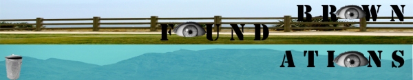
Leigh Ofer – brown foundations header

7-Araceli Mendez- Another T-shirt

In this t-shirt you can see the state of Rhode Island (with Providence marked) and Texas (with Laredo, my hometown, marked). I was hearing a Michael Buble song called Home when I was inspired to do this shirt. The lyrics of the song are in the t-shirt. Although I lived in Laredo, TX for 18 years before coming to Providence, I feel like Providence has earned the right to be called home because of the second family I’ve been able to find among my friends.
Mila – more T-shirts
These designs came from fiddling with hue/saturation and superposition of some photographs I took last summer. 

Xavier Sawada – Header

6-Araceli Mendez- More T shirts


Two tshirts with boomboxes. 🙂
Mila – T-Shirt
Since posting my T-shirt designs, I have discovered the smudge-stick filter in photoshop, which makes my white Barack look slightly more legit and less like an albino. So, here is my revised design. 
7-Rebecca: tee-shirt
Since I have the utmost difficulty with technology, I decided to use more conventional mediums of art, and this is my product. Inspired by artists like Klimt, I ws fascinated with how multiple images work together to create a larger piece, but still retain their individual properties. This is a collage of pieces from my room, sketch books, and magazines, tweeked on photoshop, then overlaid. 
Michael Norris – blog header redesign

Charis Loke – Tshirt (non)possibility
While staring at my sketchbook over the weekend, I realized why I’ve always actively shunned any form of art class: requirements and deadlines. It’s much more complex than those two words, of course, but I’ve been rediscovering what a pain it is to try to come up with proper ideas to be presented to others in the middle of an art burnout.
Still, requirements will be requirements, and assignments will be assignments, and I suppose this is all part of the ‘pushing yourself’ part of college. This will not be my final t-shirt design, but it is one of the ideas I had that actually saw the light of Photoshop, which is pretty sad, considering this wasn’t exactly a ‘new’ drawing either.
What does it mean to ‘obey art’? Is it to follow your inner muse? To go where your artistic proclivities take you? Or follow conventions of art set by others, or choose to rebel against them for the sake of rebelling (and the ensuing feel-good factor)? Do you stay true to your own art at the expense of, perhaps, public acceptance, growth, exploration? What is art, anyway?

Because It Says So
Come to think of it, I don’t actually know why I ever drew this in the first place. This must have been the effect of staring at too many Shepard Fairey paintings.
5-katie glerum: teh banerz
Hi!
Sorry everyone that I’m posting this so late! My illiteracy of technology was problematic for me.
Anyway! I made these banners just by finding random images that I thought were pretty sweet and then incorporating them into the picture. The limecat is my favorite. But I also think the tattooed tongue is awesome. I think that it was photoshopped, but not by me..


4-katie glerum: t shirt design

Here is a t shirt design. I tend to group graphic ts in the catagories of clever, public service annoucements, or other. Here I tried to combine the clever and public service catagories. I thought it was silly that the earth would appear with a temperature to show that it was “warm.”
HEADER:JULIECáRDENAS

the back ground image is the van wickle gates.
6-Rebecca: Blog Header

5-Rebecca: street art
I came across this online while researching Chile, and I thought it was a cool image to share with the class. The street art movement has exploded in the Latin American community and the messages are really powerful. Check them out.
Leigh Ofer- t shirt
I come from Israel and I try to keep up with local news by reading “Haaretz,” an english-language newspaper that circulates nationwide. I came across a very interesting article in that questioned the rise in violence amongst Israeli teens. The journalist asked, is it because of the constant political turmoil that surrounds Israeli youth that brings out their destructive tendencies? Violence, it seems, is everywhere and is seeping through osmosis into the minds of Israeli youth.
However I disagree. I am Israeli and therefore I had to serve a mandatory two years in the Israeli Defense Forces. Violence comes from many things: a lack of parental love, too much leniency in the educational system, a lack of morality and values, etc. I believe political violence is different, and does not work through osmosis: I believe in the opposite. People unite together AGAINST violence. My fellow soldiers serve their country not for the sake of revenge and for increasing violence, but for peace. There is not one Israeli that I know that does not want peace. We all enlist in the army for that reason, so we can go into the mall without being checked by a security guard, so we get on an El-Al flight without coming to the airport six hours in advance for the security check, so we can use public transportation without an incessant, nagging fear.
I created my T-shirt from a picture I took six months ago. The message I am trying to relay is that yes, people enlist in the army to FIGHT, but it is not to fight in order to create more discord, it is to fight for peace, especially for peace of mind, and to defend our right to exist.
-
- The original picture

julie cardenas: tee-shirts

glORIGAMI

A Tribute to two of my favorite film makers: Stan Brakhage ( mothlight) and Jan Svankmajer ( Alice in Wonderland)
First there were distressed jeans, now there is a pre-wrinkled shirt. YAY, hipsters rejoice!
This is an inside joke, and consequently the image I like best. LATFH refers to the blog latfh.com. “Pickles Surprise” refers to a film by Tom Rubnitz. The boy featured is the individual who shared the aforementioned media with me.

Elizabeth Karin – tshirt possibility
I had a song stuck in my head while trying to think of tshirt designs. This one line was just replaying over and over, “There ain’t no reason things are this way. Its how they always been and they intend to stay,” so I started thinking about what things would look like if they weren’t “this way”. I was thinking about if things were upside down or flipped around and played with the actual words and came up with this:
Then when thinking about the header, I was staring kind of blankly at this tile table. The coloring was black and brown, and it looked a lot like a jumble of pixels when you zoom in really tight on photoshop. I started sketching a bit and this is what happened:

5-Araceli Mendez-T Shirt

With a new year there is new people to meet and my name is always on mind whether it is because it is odd or hard to pronounce. Here I bring one of the many myths about the constellation Ara. The constellation is in the center while a Centaur, Chiron, is on the upper right hand side and an altar on the other side. The story says Chiron was the creator of the altar so that sacrifices could be made for him. Of course this is one of many many stories, but at one point Ara was considered Ara Centauri in his honor.
EVE-T-shirt mock up
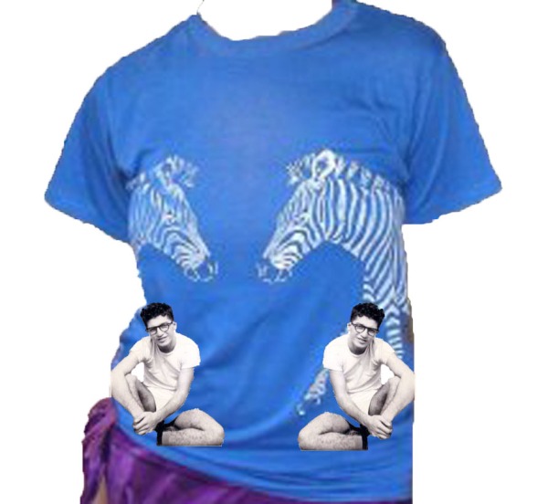
This is a cut out of me wearing my Grandpa’s shirt. He gave me this shirt when I was ten years old and he couldn’t fit into it anymore…My grandpa is pictured here as a young man parallel to the zebras.
(My pose/absent arms reminds me of the Venus de Milo statue)
Tim Nassau: “I like words…”
…so my t-shirt design and blog header have something to do with them.
For the blog, I thought it might be fun to reinterpret Brownfoundations not as Brown foundations, but brown found -ations, as in words that end with ation. I would have loved to wander around Providence looking for found words (which I suppose is somewhat tantamount to found art) to use, but in the interest of time I did my exploring on google, a sort of 21st century stroll if you will (perhaps someone should rewrite “Ulysses” as a one day trek through the interweb. They could call it “i ❤ homer, lol”). Here’s what I came up with:

For my t-shirt I have 2 designs:

The sketch was my first t-shirt idea, and I decided to amp up the political connotations of the flag by placing it on the Capitol (if anyone’s interests I got “Nobody’s Home” from a book of the same title by Dubravka Eugresic). A lot of political shirts tend to lean towards some form of clear cut ideology (for example, all the Obama shirts from last year), so I wanted to make something a little more far reaching and ambiguous (I think ambiguity is a huge part of the art that appeals to me.)
And #2:
 For some reason I find the idea of mimes doing sign language incredibly amusing. The idea of mutes appropriating the language and symbols of other people who talk without speaking also resonates with themes of language and communication. Semaphore flags were easier to do, plus they create a more interesting color contrast. I’m still hesitant about working outside of black and white so this was an easy way to add some life. Bonus points for anyone who finds out what they’re saying… I promise it’s not gibberish.
EVE -Header
Playing with idea of “foundation” …here the mountains and sky below support the land and water above. I put a photograph I took of land/sea above another image I captured of mountains/sky to challenge my/our conceptions of “foundation.” Is a single conception of artistic foundation necessary for all subsequent creations? Is there, or should there be, “right” kind of foundation for everyone? I am challenging my own idea of foundation by inverting the sky and earth. Human eyes stare back at the viewer probing the viewer to develop her/his own notion of foundation. The garbage can serves for throwing away/retrieving ideas (I have enjoyed using so-called “garbage” in creating art).
lauren armstrong — t-shirt mock-up
 So, I know that this is really geometric and looks like you could buy it at American Apparel, but I was trying to play with colors that I’m not used to. My plan is to use all the experience I just had with creating this geometric design to make something more interesting for the final t-shirt design.
Mila – T-shirts
Here are some funny T-Shirt design ideas involving Barack Obama. I actually really like Barack Obama (go Kenya!) but I figure if you’re going to design a T-shirt, it may as well be semi-controversial.


Blog Header

I wanted to create a design that reflects a fun and artistic learning environment. The charcoal scribble in the background represents an artist’s thumbnail sketches. It’s the initial rough sketching that makes all the creative, original final designs on this post possible- so, I felt I needed to show that. While making this header, I tried to keep in mind simplicity and boldness, two things which we discussed as a class last lesson.
Emma Whitford: Header and T-Shirt Mockup
My header incorporates a picture I took of bricks behind the new mural on the Thayer Street CVS. I wanted to use real bricks, and was excited to stumble across these vibrant ones. The text and lines are pretty shoddy, but I hope that reflects the fact that we’re in this class to construct a foundation. Everybody has to start somewhere, right?

Below is my mockup for a t-shirt. I may totally switch gears from this, but I’ve been playing around with images of catfish. I spent a month in rural Alabama this summer, in a region that is entirely economically dependent on the catfish industry. It’s a vicious cycle, because catfish is lucrative for the state, but the fish plants can’t provide lucrative jobs to workers. I want to make a sinister play on the classic song “Stars Fell on Alabama,” possibly suggesting that Alabama is being crushed by the catfish. The phrase “Stars Fell on Alabama” also appears on all of the state license plates in the state. I’m going to have to make adjustments in terms of actual dimensions for the final design.

Greg Young – T-Shirt Mock-up
This is one of my T-shirt designs that didn’t make the cut. I like the idea because of the play on what’s expected from a fire extinguisher (to put out a fire) with what it’s actually doing (spewing more fire.) I also liked the contrast between the cartoon-ish fire extinguisher shape and the realistic flames and smoke (taken from a photographic image of a flamethrower.)

lauren armstrong — blog redesign challenge

Foundations Blog Redesign
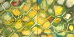
I chose to use color as the main focus of my blog header. I love the colors in the mosaic tile background and wanted the title to very clear.
Greg Young – Blog Header
Inspired by one of the slides we saw on the first day of class, I wanted to put a modern twist on a classic piece. I feel like this embodies one of the goals of the class: to offer something original while still drawing influence from existing styles and principles.

Mila – Blog Header
This is my first blog header design. I like the image, but had to centralize it in the 920×180 image restriction and didn’t really like the final result.

Here is my second idea, which fits the required size better.

Xavier Sawada – T-shirt ideas
There are so many different Brown shirts I see every day, but here is an idea for a design that represents my freshman perspective of our school:
The second is a rip off the ridiculously popular John & Paul & George & Ringo shirts.


rocio- blog designs
I chose these two designs for the header of the blog because they are both clear and simple. The first one has more of a “Brown feel” for me because of the text and design. However, I felt the second was more appropriate because bricks are the foundations of buildings, and this course is providing a foundation for our artistic knowledge and creativity.


Xavi Sawada – Business Card

 I wanted to visually represent my DJ name to make it easier to remember, so I used my limited photoshop abilities to paint a red cranberry and place “DJ” in it in white. I realize it is very simple, but I think it effectively advertises my DJ name. The back again reinforces the DJ name with cranberries in the background and contact info in white.
rocio: t-shirt idea
This was one of my first ideas when designing a shirt. I wanted to make a shirt with a message that would hopefully raise awareness on the issue of immigration reform. As a Mexican immigrant, I feel that many people are not well-informed on the issue or simply see it as a black or white debate. For this reason, I felt it was important to create a shirt that would inspire constructive dialog and lead to action. I was also inspired by Barack Obama’s speech in Berlin, especially by his statement, ” The greatest danger of all is to allow new walls to divide us from one another.”
rocio bravo: t-shirt design
4-Rebecca: shirt design
 The title of this shirt was “I overcomplicate things” and I thought it was very accurate of what we do, but in a humorous depiction of the train of thought. I also like that the design is like a pin-ball game, and the play on words of our minds really being the game we play.
3-Rebecca:mock up t-shirt
 This is a quick tee-shirt idea I had. Drug Policy Reform is a HUGE focus of mine, so I thought my tee-shirt should have something to say about ending the drug war. I want to add more body bags with other titles of nonsensicle reasons why the war on drugs works, and show how they have failed.
4-Araceli Mendez-Header

I don’t know who that hand belongs to but that’s okay.
4 – Charis Loke – Header
 A full sized version can be viewed here.
Credit for stock images:
Header – Ethan Z.

3-Ethan Zisson: T-Shirt First Draft
 This was the first silly idea that popped into my head.
Mila Owen – Business ‘Cards’

 The function of a business card is to make sure people remember who you are and how to contact you. I liked the idea of a photograph because it is the most succinct way to express my personality. My brown e-mail address is the only text because it expresses my profession as a student, contains my full name and is the best way to contact me since I am really bad at answering my phone. I also like the simplicity of this because at this stage of my life my career goals are largely undefined and the fact that I am a Brown student says a lot about what I am doing and thinking at this point. I did not make it square because most people that I exchange contact information with do not have wallets, much less business card holders, so I did not feel it was necessary to follow that form. This line of thinking led to my second idea of a pen. Most people store information electronically, rather than on paper and are more likely to hang onto a writing implement than a piece of paper. Besides, who doesn’t like a free pen? I also love fountain pens and think they convey something of my personality (impractical but romantic perhaps?) and purple is my favorite color.
lauren armstrong – what is art?
I believe that art is a form of expression and interpretation. The greatest thing, in my opinion, about art is that you have the freedom to make a statement and use creativity to share your personal perspective. It is a medium through which you can show other people your ideas in a way you can’t do just with words or sounds. Two of my favorite artists are Vincent VanGogh and Jenny Saville. I love the way they each use the paint to blend, or not.

Jenny Saville painting

Vincent VanGogh painting
lauren armstrong — business card businessss
I wasn’t sure at first how to approach this assignment. First, I tried to make a card that represented me. I thought about how I could try to represent myself as an entire entity just on one little business card. After a while of trying to represent myself, I switched my attention to trying to represent a product. I tried to think about getting a message across, about a color story that made sense for the product, and creating an icon that the product could be remembered with. I made up two different businesses; the first an event planning company and the second a sustainable home design firm.

rocio bravo- business card
When contemplating ideas for a business card, I began looking at other people’s cards kept in my wallet. Although they are all professional and useful, there was not one that really caught my eye. So as I began coming up with ideas, I realized that it would be hard to miss one resembling something else, like an identification card or credit card. In an attempt to make my card distinctive, I decided to use the background of my driver’s license. I did, however, replace the original information with more pertinent details. Because I do not have a degree or a profession yet, I felt that adding information such as the university I am attending and concentration was a temporary substitute. I also decided to keep the picture of myself to make it more personal and help ensure that the person receiving my card remembers who I am. Although the background image is not original, I feel the overall result is unique and attention-grabbing.

Elizabeth Karin – business card
 I really wasn’t sure what I wanted to show on my business card because I have always associated having a business card with having a profession. My sister got her first business card that says “doctor” on it; my father’s declare that he is a lawyer. It seems like business cards are about labels and categories. I don’t know yet what label would apply to me, just as I’m sure a lot of other students can’t say for sure either. As of now I am a work in progress, hardly sure of my concentration let alone my professional label, so that is what I wanted to represent myself as on my card.

This card is kind of a mish-mosh of what I do and what’s important to me. I played around with a lot of the photoshop filters and options and tried to incorporate the Gestalt principle of closure.
And here’s a t-shirt from threadless that I thought was funny (corrupting an old childhood toy):

My Little Outlaws - threadless
3 – Charis Loke – Business Card (edited)

Card and Wheels
Considering that a business card is supposed to convey some aspect of one’s self, I wanted my art to be part of the card, but had to do so in a way that the viewer wouldn’t be confronted with too many images at once. Making the card interactive* seemed to be one of the solutions.
At first I thought of making a circular card, using just the wheels held together with a rivet so that they were each individually swivellable, but the white words on the plastic wheel would not be very readable on top of a highly contrasted background (and you can’t get a circle at 2×3.5 inches), so I integrated them into a standard rectangular card.

Front
The black rectangle can be thought of as an envelope with a window cut through it, so a quarter of the paper wheel nested within it always shows, on both sides. The window is the only geometric shape in the card with a curved contour, helping it to contrast with the other shapes (diamond, rectangle) and direct the eye to wheel. The wheel’s actual size is slightly larger than what the window suggests, so it stays in place within the black ‘envelope’. This conveys a sense that there is always more than meets the eye, which I suppose is a fine thing to say with my business card.

Back
The wheel itself has different images on its two faces, as illustrated, maximizing the number of images I could have the card show. At the back, an additional transparent plastic wheel is attached, also via the rivet, and it can swivel as well. It contains other essential business card information, and four arbitrary words describing my work. One could play around with it to get the word that best describes the image directly below – in the picture above, ‘Design’ corresponds to a digital graphic poster I’d made previously. I like to have a lot of detail in my work, and this is conveyed by the many different things a person could do with the card, instead of just holding and looking at it.
The repeating diamond patterns (proximity, in terms of the Gestalt principles) would not actually be part of the paper itself, but a smooth, slightly shiny layer on top of the matte black background, giving the card a nice texture and sheen (which I’ve tried to replicate by airbrushing the corners) and helping to tie all of the elements in it together. The wheel would not have the diamond texture on it, just a matte one, in order to create contrast in texture as well.
Of course, this isn’t the most economical business card around, but I like to indulge in such fantasies every now and then.
*If only strictly 2D cards are allowed, the card would remain essentially the same, with the ‘window’ at the back filled over with the standard black patterned background, and the words on the plastic wheel becoming part of the print. The matte and shiny layers would then overlay everything except the quarter of the image on the front, and I would crack my head choosing the particular image. This post would also be a lot shorter.
Post 2 – Rebecca McGoldrick: Business Card
3-Katie Glerum: whoops and a tshirt!
So, I’m not really a big fan of graphic tshirts. But I really appreciate some despite the fact that I might not actually where them. I thought that this one was really funny. I think the double meaning is funny. And so is the expression shady.

2- katie glerum: bussiness card
I write on my body a lot to remember things. Therefore, my business card is an image of my wrist, where I tend to write things. I originally wrote my name on me, but after I distorted the image, it was no longer visible. I thought the distortion was sweet so I kept it and instead just typed my name/ email instead. I really love lots of color.

Emma Whitford: Business Card and T-Shirt Love — One Fell Swoop

My business card is a combination of show and tell. I literally show myself (in a perhaps less-than-flattering light) and tell the possessor of my card what I am about in a 2.5″ x 3″ biography. I tried to use the line of my gaze as an example of continuation, drawing the viewer’s eye from my slack jaw to my phone number and middle name. My middle name is my favorite name, and, especially now, helps to distinguish me from all the other Emma W’s out there. Harhar…. I also played with proximity by multiplying myself and overlapping identical images. I have no idea what business I might find myself in a few years from now, but right now collecting seems pretty attractive!
And now a t-shirt:

"Conservation Status" -- Threadless

Let me preface this with a confession: I have never been that into Threadless. I had low expectations leading up to this assignment. However, this particular shirt caught my eye right away. I love that the image fills the whole space of the t-shirt without looking crowded or messy. I am always drawn to splashes of color and the simplicity of silhouette, as detail and print on clothing takes a long gaze to interpret. The message of the shirt is funny and clever—the statement that humans tend to rank the importance of living creatures is anything but harsh. I also like that the humor of the shirt increases from top to bottom, developing into a joke when read with a natural scan of the eyes.
Eve Blazo- Business Card

I am thinking about perception.
When I first meet you and give you my business card, you imagine things about me (and about the image on the card) without having the full knowledge of who I am. Your perception of me from this card is based more on your own expectations and previous human interactions than my identity apart from your judgment (yet what is my identity without your perception, or what I assume you perceive, to create it?)
I took this photograph while flying over California. The actual image I took with my camera was not able to reproduce how the land looked with the naked eye nor how I desired it to look. Photoshop allowed me to construct how I perceived the land, and further, how I wish the land had looked. Overlaying the image, I included multiple copies of a Sylvia Plath poem entitled “Mad Girl’s Love Song.” Plath describes how our world is construed by our eyes alone and when we close our eyes it disappears (“I shut my eyes and all the world drops dead”). She’s implying that humans construct the world and ideas (art/science/religion) emotions (love) as narratives that assign meaning to life. These narratives are entirely unique to each of us given our inherently different perceptions (“I think I made you up inside my head”). Plath is considered mad, but really she’s just seeing through her own eyes. Or maybe we are all mad. Nevertheless, you imagine me and I imagine you and the world (etc) goes on without us.
I am expressing that a single card cannot represent the multitudinousness in each of us. Yet this ritual persists. Playing along, I give you my card knowing you will see things in me and the image that I cannot see or didn’t intend for you to see. This is the thrill of creation.
Greg Young – Business Card

I took this opportunity to make a card advertising a show I do with my friend Christine on Brown Student Radio called The Pleasure Principle (it airs Mondays at 6:30 on bsrlive.com.) Even though we usually don’t spin actual records, I used a turntable as inspiration for my design. Because I had to include a lot of information and didn’t want to waste any space, I tried to make the most out of the text by incorporating the shapes of the words into as many parts of the turntable as possible. I avoided using color because I really like the contrast between black, white, and grey and I wanted a more simplistic feel. I only used circles and rectangles for my shapes because I wanted the card to have a sense of unity.
Rocio Bravo- interesting t-shirt design
“Deforestation” by Rick Crane. threadless.com

I chose this t-shirt because when I was browsing online trying to find an article of clothing that really stuck out, I kept coming back to this design and the message printed on front. I am not a fan of many of the quirky messages written on today’s t-shirts, like “Your boyfriend thinks I’m hot;” however, I am a fan of the more serious messages that take a stand on different policies or events, such as the War in Iraq or Genocide in Sudan. For that reason, I found this shirt particularly interesting. While it clearly gives an image of the harm we are doing to our earth by using up our resources at such a devastating rate, it does not say anything about deforestation; in fact, is doesn’t say anything at all. I find this to be an interesting approach to expressing personal views while not explicitly saying what they are. Ultimately, I feel it creates a healthy interaction between the person wearing the shirt and the viewer because the shirt simply states the facts without imposing a stand.


3 Araceli Mendez-Business Card

So my business card is really simple. I think simplicity is good for business card, especially when it comes to information. Plus at the moment I don’t have a degree or title to brag about. Unfortunately I didn’t realize having a white background wouldn’t look too great on the blog, but I like how peaceful and clean a white business card looks. I really liked the idea of using grays with a little bit of color which was really my response after finding the t-shirt design I posted earlier. Other than that I really like my business card. 🙂
julieta cardenas- business cardzz
Coming up with an idea I was happy with took a while. The results are supposed to feel intimate, because sometimes I think business cards feel too formal. -julie

2-Ethan Zisson: Business Card
I had the idea to draw a double helix, but then I wanted to make it out of some cool shape like the gestalt principles outlined. Then I wanted it to say something interesting. I actually do not believe in the statement I included on the business card, but I think it makes it stand out, much more than a name or a number ever could. I hope it doesn’t offend anybody; it’s supposed to be a science joke.

Tim Nassau – Business Cards
I apologize in advance for the large number of images I’m about to post… I got a little carried away here because once I had an initial design, it was very easy to make slight variations on it.
The basic idea for my design was inspired by the Belgian painter James Ensor’s business card:

I love the stark black and white colors, the minimal amount of information (to be fair he was born when email and phones didn’t exist, but even his address is hard to read, and is definitely not as important as the name), and the grim motif of death. Since I don’t (yet) consider “artist-painter” to be my profession, I went even more bare bones:

And then tried a minor adjustment:
Though I’m partial to the minimalism above, I wanted to get a little more across, so I wrote a little, slightly absurd, poem. What I’ve ended up with is something of an anti-business card. The point of BCs is usually to give some useful information to their bearers, but instead they would simply get a name (if they can read it) and a nonsensical poem, presumably leaving them even more confused and hopefully encouraging them to want to know me better, rather than learning about me from a piece of paper:
Then I threw in some images… Just for the record, the robot is from a t-shirt designed by the (amazing) graphic novelist Chris Ware which is for sale at shirt.woot.com which was mentioned below by Arceli.
And again: Sorry once more for the length of this post… This is probably more than anyone ever wanted to know about my creative process in designing business card.
2-Araceli Mendez-T-shirt Designs
 I found this t-shirt in shirt.woot.com. They make a derby every week in which artists can enter a t-shirt design to be voted on. The person with the most votes who follows the instructions correctly (whether it is the theme of the week or the 6 color limit) will have their t-shirt printed and sold through the website.
This design is called Folded Flight. I find it’s simplicity extremely elegant. There are a lot of things I like about this shirt. The kanji symbol on the bottom left isn’t dominating the design because of the light color being used. It is a nice addition plus the symbol means flight. The choice of light gray shades really draws the eye to the red bird. However, the fact that the shirt is a light almost peach color doesn’t make the red bird too dramatic. I also like the small design in the bird’s back because it gives it texture. My favorite part of the design is that the birds are origami birds. Although it isn’t actual paper thanks to the different shades of red and added texture it gives the bird dimension and the simple squares are perceived as a whole.
2 – Charis Loke – T-Shirt Designs

'Limited Edition' - Headline Shirts
Yes, we’re not cool.
I like how this shirt pokes fun at the increasing commercialization of and demand for ‘indie’ designers, by those who find it desirable to project themselves as shunning ‘overcommercialized’ brands and items in favour of ‘marginalized creative types’. Being part of a select group of people who are aware of and can identify a certain artist’s work is fun, if only for the sake of being able to know something that the general public doesn’t, to feel special and distinct. An example of that would be Shepard Fairey’s Obey Giant street art work; the response by people unaware of the motif of such images, and the response by those who know what it is all about, would differ. (Unfortunately Fairey’s work is becoming increasingly commercialized – you can find Obey Giant stickers on sale at the mall)
But we can still read, even if we’re not cool, which means we can ‘understand’ this shirt:

'You Look Funny Doing That With Your Head' - SnorgTees
The design interacts with the viewer in a circular way – the viewer may (consciously or unconsciously) rotate his or her head in order to view the design more clearly, which turns out to be a commentary on that action itself and therefore the viewer. It makes for good fun and conversation-starters, although, as all such t-shirts go, wear at your own risk.
Greg Young – Interesting T-Shirt Design
This shirt, entitled “The Apple”, was designed by Tang Yau Hoong and printed by threadless.com:


This shirt first jumped out at me because of the design’s shape and the color contrast between the pictured object and the t-shirt. Upon closer inspection, the various textures in the apple’s skin and soft, fleshy insides appealed to my senses (it looks delicious and crisp) and I was intrigued by the clever combination of the forbidden fruit and the snake (both from the story of Adam and Eve) into one cohesive whole. The transition between peel and snake is almost seamless and I especially like how the snake remains flat and folds its body over itself, mixing both 2-dimensional and 3-dimensional elements into one image.
What is Art?

Art is the expression of energy. It is energy that manifests itself on a once black page and is finally release when pen, or pencil, or oils, or mixed mediums touch the paper. Art begins where words fail. Art moves the heart while words move the mind, and without words, art allows us to explore the reactions of our hearts. Art captures energy and all emotion in an everlasting frame. Art makes us question the world around us, and question ourselves. Art is meditative.
Xavier Sawada – What is Art?
Art is created when an artist begins with a concept he/she wants to express, and then relays it to his/her audience through some sort of medium. The concept could be of an emotion, a state of mind, a thought, how an object looks/feels to the artist, etc. Art is successful when the artist understands his/her intended audience (which could be just him/herself), and has the technical skills necessary to reveal his/her concept to it. This makes the value of a work of art very subjective, so it is hard to say what “good” or “bad” art is.
This is Bleu II by Joan Miro:

||-JUDITH SUPINE-||
 Judith Supine is both an activist and an artist. His work transcends the walls of galleries and becomes a part of New York’s cityscape. His work even extends past the borders of New York, since photographs of his collages and videos of his work are easily found on the internet on sites such as flikr and YouTube. For those not familiar with Judith ( yes he is male, he took on his mother’s name and “supine” as the birthing position as his name to avoid run-ins with the law). Judith has hung his work off the Manhattan Bridge and made it float on the East river. In addition he has also posted his work on the Army recruitment center in Times Square.
http://www.flickr.com/photos/judithsupine/
-julie
Julieta Cardenas: “what is art?”

Greg Young – What Is Art?
Art is something created that, either through its process of creation or the end result, evokes some emotional response in at least one observer. It is a mode of transferring emotions among individuals. Art doesn’t have to be beautiful, but it does have to inspire. Take, for example, Ron Mueck’s untitled sculpture:

This is not at all beautiful or aesthetically pleasing in the traditional sense, but it is art. Whether your response to this sculpture is fear, disgust, or pity does not matter; the response itself validates the sculpture’s status as a work of art. Art appeals to our most visceral emotions and instincts in a way that usual dialogue cannot. It serves as a way of expressing feelings and communicating ideas from creator to observer at a more basic and direct level. Mueck could have just told us about the sad old naked man represented by the sculpture, but it would lose something in the translation that is apparent in the sculpture. In creative writing classes we’re usually told to “show, don’t tell.” Art is the way we can “show.”
Elizabeth Karin – What is art?

Splash of Color taken by Ryan Taylor
Art is the physical manifestation (performance, painting, sculpture, drawing, etc.) of an idea or concept that the artist wants to share. The artist may have a specific concept in mind, but the beauty of art is that there are no limitations on how a viewer can interpret a piece of artwork. A viewer is given a window into the mind of the artist and the concept he or she wanted to convey yet has the freedom to find a different meaning. Art is about having the freedom to express yourself, whether it be a personal, political, or controversial thought, and can often times be the only means of sharing an idea that’s otherwise hard to express. Evaluating art brings people to the task of finding their own definition of beauty which is such a subjective idea that draws on personal experience and beliefs.
Emma Whitford: What is Art?
")
"Woman Combing Her Hair" (1886) Degas
If I try to define clearly what art IS, it becomes possible to start pointing out what art ISN’T. Therefore, I would define art as broadly as possible. Art is a tangible object, a movement, a sound, an image, or an outpouring of thought that has been produced by some human effort, however small. Art cannot exist in a vacuum, and, like an historical fact, is more meaningful when considered in context. For example, Beethoven’s symphonies are more meaningful in the context of his deafness and his legless piano. Art is also the means by which we find beauty in seemingly mundane acts and simple human rituals (Degas, above). It can be an artist’s means by which to make sense of his surroundings. Art can project the artist’s intention and at the same time allow the observer to gain something entirely unique and personal.
This quote is from an Emerson reading for a class I’m taking called “Literature of the American Renaissance.”
Art is creativity, and Emerson defines creativity as follows:
“…genius looks forward: the eyes of men are set in his forehead, not in his hindhead: man hopes, genius creates….There are creative manners, there are creative actions, there are creative words; manners, actions, words, that is, indicative of no custom or authority, but springing spontaneous from the mind’s own sense of good and fair.”
Basically, art comes from within!
1-Katie Glerum: Art is Art
Art is art. It is something that someone puts in the world to be art. It is expressive and aethetically something–pleasing, revolting. Whatever it is, it evokes feelings and provokes discussions. An artist can create art or can take something thats not art and make it art. On a tour of a friends house, I noticed her bicycle hanging and I called it art, because it was hanging where one might hang some piece of art. She corrected me and told me that it wasn’t art, it was just where she hung her bike. So its not art, at least to her. However, the only thing she would have to do to make it art, is call it art. If she was riding it, it might be become a bicycle again, but if its hung on the wall to decorate, or add something aesthetic to the room, it would be art.
For example in this attached clip of lady gaga, she walks into a press conference with a mask covering her face. It causes a commotion because people aren’t quite sure why. But after she calls it art it seems to make sense. But before she called it art, the people there did not recognize it as art. In order for something to be art, one must claim it as art.
1 – Charis Loke: What is Art?
Art is a vehicle, unfettered by medium, for conveying and arousing any amount and manner of thoughts, emotions, statements, questions, and intentions, which are not necessarily wholly the artist’s own. It is given meaning and value by both the artist and viewer (or non-viewer). According an element the title of ‘art’ associates with it a set of meanings and preconceptions (for example, proficiency in a medium/technique, creativity, distinction from ‘normal’ elements) specific to the culture and context in which the element exists, was made, and was viewed.
")
Callesen - Down the River (Papercut)
Its ability to evoke strong feelings in people means that art is often a contentious subject (and prone to being discussed in convoluted language); an example would be the debate on whether mastery of technique, or intention alone, or both, make something ‘art’.
The element of craftsmanship, both in the artwork itself and in the conveyed meaning, is traditionally associated with art, and while not ubiquitous, often makes for a more fulfilling experience for the viewer and artist.

Callesen - Down the River (Detail)
Art means taking risks- Rocio Bravo

Art is creativity. It is about making something new and original. Art means stepping out of one’s comfort zone, letting one’s imagination take control and transforming that energy into something that transcends boundaries or norms. Art is about creating something that makes you feel and think. It refers to a painting, a song, a sculpture, or anything else that stirs one’s emotions and revives our imagination. Ultimately, art is about taking risks and letting go of the rules in order to express personal thoughts and feelings.
Tim Nassau – Art is Shit

Art is what comes from the daily consumption of life. We take that nourishment, turn it into something new inside ourselves, and then expel it outwards, sometimes peacefully, sometimes explosively, but never without a splash, no matter how small. And often it is flushed away, never to be seen again, but the occasional brave soul puts it in a tin to share with the world. And sometimes we use it to grow our plants, to feed our food, and the cycle continues. We can not live without it; Everyone produces it; And sometimes it stinks.
Eve Blazo- What is Art?

Eikoh Hosoe, “Embrace 70” 1971
ART is beauty. When one makes art, one declares something beautiful. Even in the most grotesque or disturbing works, the viewer is asked to relate to the creation by finding some kind of pleasure and humanity. At its best, art is the universally human experience of the sublime, of being in awe and fear of overwhelming and unknowable beauty in one’s own self and that infinitely larger than one’s self.
Art is transcendent in that it takes us beyond our tangible realities and into the mind of the artist by allowing us to briefly see/hear/smell/touch/taste through another’s eyes. Works considered more “artistic” based on skill, technique, or nationality, are merely the result of people in power with certain motivations beyond pure subjective human pleasure.
Fundamentally, art is emotional, and thus a human-connector.
1-Ethan Zisson: What is art?

Like many of Dali’s paintings, this piece challenges the viewer to determine what is perceived of the landscape. In much the same way an artist uses a physical medium to portray what is only truly present in his imagination, “Sphinxes of Bikini” uses its abstract landscape to draw human heads. When we ask ourselves “What is art?”, it is important to think about we create art with. This piece demonstrates the extent to which we can perceive those mediums.
What is Art?
No. 1-Araceli Mendez: The Cafe Terrace on the Place du Forum by Vincent van Gogh
 Art is the deliberate creation of a product or process with an intention beyond utility. Art can be found in different modes such as film, paintings, furniture, clothing, cars, sculptures, etc.
A work of art can sometimes be found aesthetically pleasing or be completely ignored for generations. Vincent van Gogh’s work, for example, wasn’t truly appreciated until after his death. While alive his work was considered too dark in comparison to the bright Impressionist paintings and he struggled to sell a painting. Now Vincent van Gogh is considered one of history’s greatest artists.
Rachel Levenson – this is Art, to me
Art is an interaction, an investment, between an individual and their surroundings. There is no painting, without a viewer, no artist without a canvas, no art without a person who called it “art.”
Because there is no art and no viewer in a black hole, the points of insertion where a viewer enters a piece of art tell you a lot about the viewer, maybe even more than it tells you about the artist.
Conscious or unconscious, it is this interaction that makes me value art as a language of expression that both works within and surpasses words.

I chose a sculpture (the second Miro published on this list) because sculpture demands a consciousness of a piece of art’s relationship with its environment (including its viewer) that I have just begun to appreciate. So to me, this is Art because of my own viewing of it. Maybe it will be for you, and maybe not. Either way, that is OK by me.
